product design
& data viz
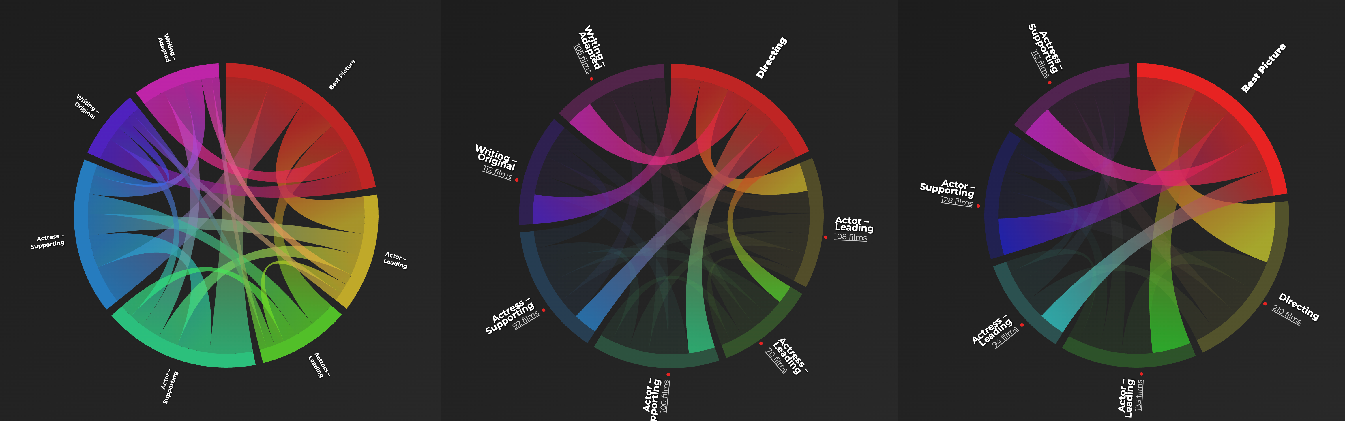
How Oscar Nominations Connect
Explore the hidden relationships between Academy Award categories.
Built with Claude Code and Cursor.
Is LEGO Going Gray?
Is LEGO going gray? How color palettes shift as more Lego sets target adults.
Built with GitHub Copilot and Cursor.
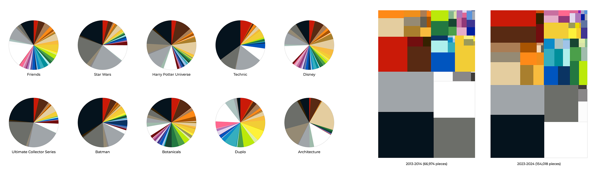
Lego Colors over the Years
Visualization showing Lego's color evolution from 5 to 120 colors across 72 years.
Fund Dashboard
Internal dashboard design providing overview and details of fund metrics and characteristics.
Baby Names
Visualization of the 50 most common US baby names from 1930 to 2014.
Songflow
Thesis project exploring tag-based music recommendations and discovery.
What is the Best Age to Win an Oscar?
Analysis of age patterns for Oscar winners across all acting categories.
Devise studio
We are a design and data visualization consultancy focused on building clear, usable analytics experiences for complex data. Our work spans UX design for dashboards, reporting tools, and decision-support systems, grounded in research, systems thinking, and close collaboration with stakeholders.
We’ve partnered with organizations across finance, media, and technology, including Goldman Sachs, JPMorgan Chase, Morgan Stanley, NBC, ABC, and News Corp.
This site showcases selected explorations and experiments in data visualization, interaction design, and emerging tools. For project inquiries or to view additional work, contact us at .